In the previous lessons we first created a Pixel component, which is the smallest unit of our application.
We then created a Canvas component, which hosts a grid of Pixel components.
In this lesson we’ll allow each Pixel component to have its own color.
To make every pixel have its own color, we’ll make the Pixel component accept a color prop.
src/components/Pixel.vue now contains this code:
<template>
  <div class="pixel"></div>
</template>

<style scoped>
.pixel {
  border: 1px solid lightgray;
  width: 30px;
  height: 30px;
  box-sizing: border-box;
}
</style>
We need to add a script tag, which will “unlock” the color prop:
<script>
export default {
  name: 'Pixel',
  props: {
    color: String
  }
}
</script>
next we output this color prop value as an additional class:
<template>
  <div :class="['pixel', color]"></div>
</template>
The color prop will have different values depending on what colors we want to support.
For example, I plan to use white, lightblue, blue and darkblue to begin with.
I style those classes by adding this CSS to the style tag of the Pixel component:
.white {
  background-color: white;
}
.lightblue {
  background-color: rgb(0, 188, 212);
}
.blue {
  background-color: rgb(3, 169, 244);
}
.darkblue {
  background-color: rgb(33, 150, 243);
}
Cool!
Now in Canvas.vue I can go and add a color prop:
<template>
  <div class="canvas">
    <Pixel v-for="n in 30*30" color="blue" />
  </div>
</template>
and here’s the result:
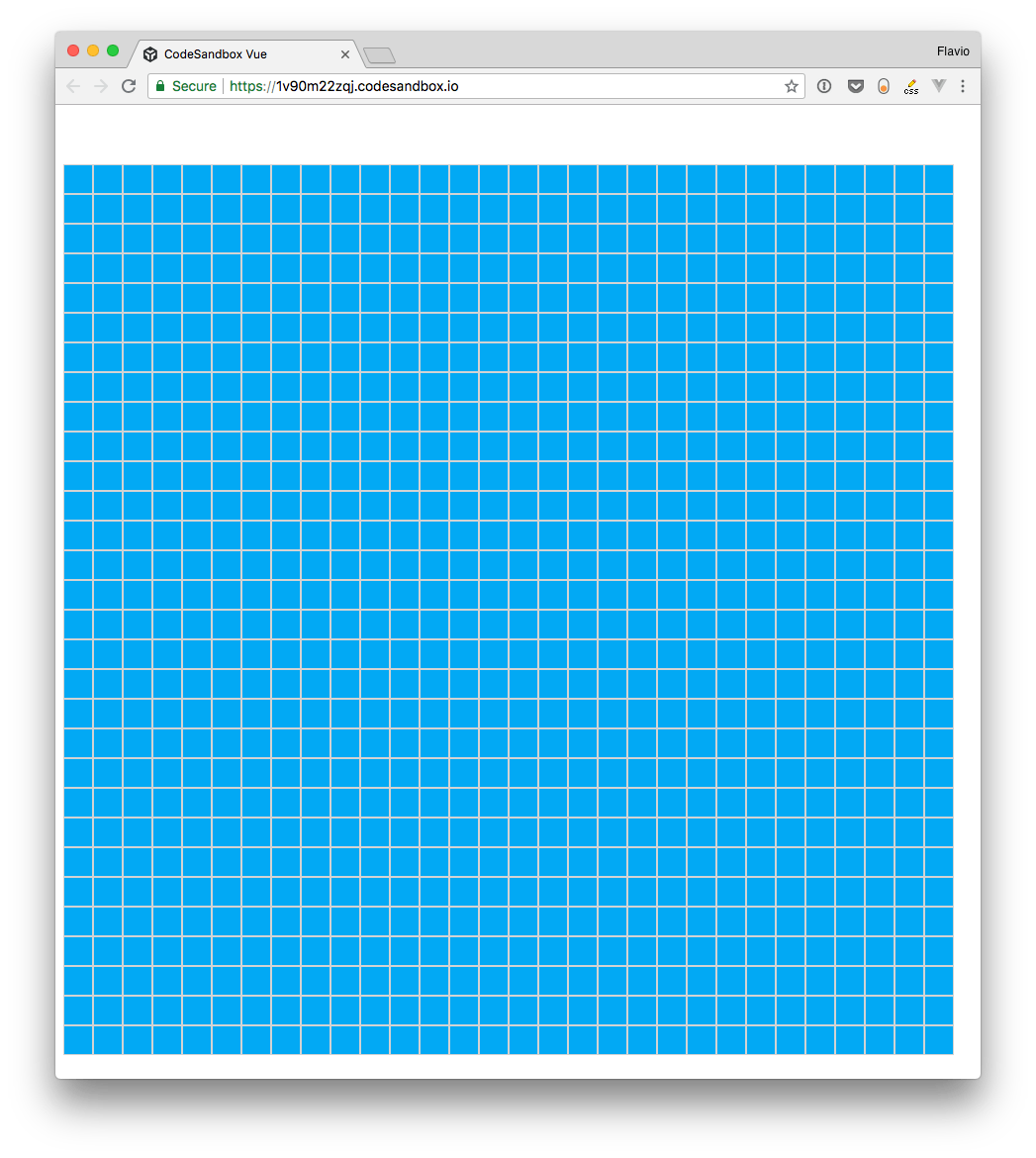
🙌
Wrapping up
We now have all we need to make our Pixel components have colors!
In the next lesson we’ll introduce a ColorPicker component, which will allow us to set the color to be used to color a Pixel.