In the previous lesson you found out what we’re going to build: a pixel coloring app!
Here we’ll create the first building block of the application. The smallest unit: a pixel.
In src/App.vue find all the places where HelloWorld appears, and replace them with Pixel. The rest of the code in this file is just like Vue CLI generated it for us:
<template>
  <div id="app">
    <Pixel/>
  </div>
</template>

<script>
import Pixel from './components/Pixel'

export default {
  name: 'App',
  components: {
    Pixel
  }
}
</script>

<style>
#app {
  font-family: 'Avenir', Helvetica, Arial, sans-serif;
  -webkit-font-smoothing: antialiased;
  -moz-osx-font-smoothing: grayscale;
  text-align: center;
  color: #2c3e50;
  margin-top: 60px;
}
</style>
Now that we told the App component to render the Pixel component, we must build it.
We create it by creating a new src/components/Pixel.vue file. You can safely remove the src/components/HelloWorld.vue file, as we’re not going to use it anymore.
In this Pixel.vue file we put a simple component definition. You saw components that defined a template, script and style tag. This, however, is so simple that it needs nothing more than the template tag:
<template>
  <div class="pixel"></div>
</template>
The pixel is now invisible.
We want it to have a little border so we can see it. In that same file, we add
<style scoped>
.pixel {
  border: 1px solid lightgray;
}
</style>
While we’re here, we set the dimensions of the pixel:
<style scoped>
.pixel {
  border: 1px solid lightgray;
  width: 30px;
  height: 30px;
  box-sizing: border-box;
}
</style>
The final component code is this:
<template>
  <div class="pixel"></div>
</template>

<style scoped>
.pixel {
  border: 1px solid lightgray;
  width: 30px;
  height: 30px;
  box-sizing: border-box;
}
</style>
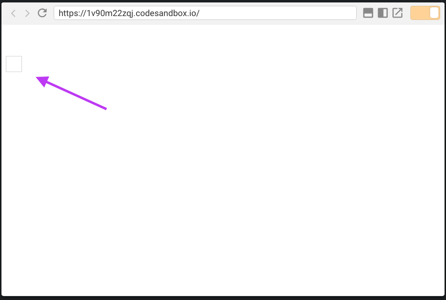
If you execute it, you will see a little pixel showing up:
Wrapping up
You have created your first Vue component!
In the next lesson we’ll combine this component and replicate it to create a grid of pixels.